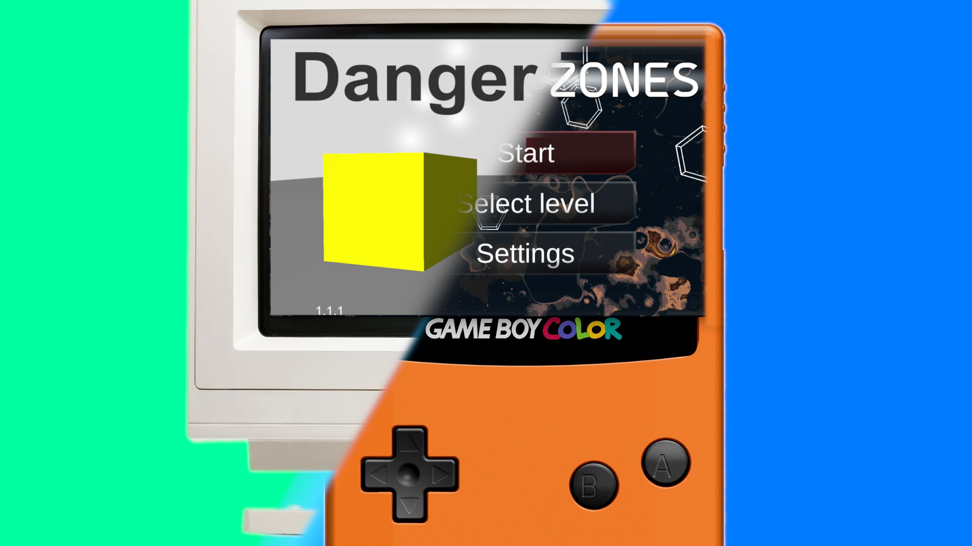
In this post, I’d like to share the thought process behind the design choices involved in creating Danger Zones: Anomaly. We explore the possibilities of designing the mobile game Danger Zones: Anomaly, as if it were a retro handheld game from the good old days that you would play on a nice summer day outside, or in the back seat of your parent’s car.
The good old days, era of retro handheld console games
As an indie game developer, I guide most of my choices with my own background as a gamer, so I’d like to share some of that background to shed light on my current choices for Danger Zones: Anomaly.
Ever since I was five years old, I have been enamored with video games. It’s the reason I started learning how to make them. The first game I ever played was Commander Keen on PC, which started out as not actually trying to complete the game, but rather to do random things like purposely letting Commander Keen fall into the spikes to listen to the funny sound effect it made. My fondest gaming memories are from playing Pokémon and Mario on my GameBoy Color, a simple yet fun system that you could bring virtually anywhere. It doesn’t have a backlight though, when playing in the backseat of the car at night, let’s hope the car passes enough street lights.
If I had more time, I’d seriously consider making a game that could run on a GameBoy as a tribute to my childhood. There are actually some projects on GitHub and some tutorials on this subject, but maybe some other day, let’s finish the current project before doing something else.
Later, as a teenager, I enjoyed a wide variety of games on different platforms: PC, Nintendo DS, PS2, PS3, and Xbox 360. However, the GameBoy Color will always hold a special place in my caffeine-addled gamer heart. Now, it’s time to make a game instead of just playing one. So, how do I go about designing my game?
Kicking Off
I start by reasoning, “What’s a game that I would like to play myself?” and more importantly, “What can I make within a reasonable timeframe?” Of course, I remember the good times from my GameBoy Color days, but that console has since retired. New handheld consoles have taken its place, but they aren’t really accessible for starter indie game developers. However, smartphones are accessible and also handheld. I’d argue that there are more people with smartphones than handheld consoles, and smartphones are just about as powerful. The idea comes to mind: “What if I make a mobile game like a retro handheld game?”
Admittedly, I don’t play many smartphone games myself. So, would I still be making a game that I’d like to play myself? My argument is that there simply aren’t enough good mobile games, I would play them more if there were more good options. The current quality and user experience for smartphone games is lackluster, which is a symptom of the market. The most profitable mobile games are filled with micro transactions and intrusive advertisements, so that’s what most mobile games get built around. It’s a shame.
As an indie game developer, I don’t have to answer to shareholders. Don’t get me wrong, I intend to monetize my game, but it won’t contain in-game currency, loot boxes, or live service elements. Currently, I think Danger Zones will be a free download with paid expansions and no ads. The expansions would include more levels, allowing me to release the game earlier and base new levels on feedback. But I digress; it’s difficult not to talk about the state of mobile games. Let’s move on to the game design choices.
Controls and Control Scheme
There is a significant difference between mobile games and handheld console games: the controls. Mobile games usually rely on a touchscreen, while handheld games feature physical buttons, a D-pad, and maybe even analog sticks. Touchscreen controls are limited in comparison, but some techniques mitigate these limitations.
Danger Zones will feature an on-screen analog stick for movement. Touchscreen gestures control frequent actions, and on-screen buttons for less frequent actions will have haptic feedback. These principles ensure a smooth experience despite a touchscreen’s limitations. Modern smartphones are compatible with physical controllers, so I intend to add full controller support to DZ:A. Ideally, I’d like the control scheme to require only a D-pad and two physical buttons, like a GameBoy. This sums up the design choices regarding the controls and control scheme of DZ:A. Controller support will be available in the first production release, as I consider this a must-have for a “mobile game that plays like a retro handheld game” experience.
Graphics, Look, and Feel
This design aspect isn’t as cut and dry as the others. I’m still learning how to approach game design, so the following text outlines the process from a learner’s perspective. I’ve figured out a good deal of the design, so the following paragraphs might seem smooth and iterative, but the process is summarized for this post. Make no mistake, the struggle was real!
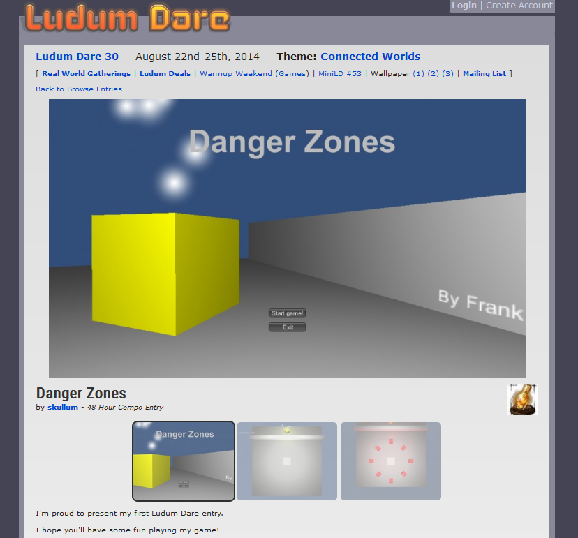
I struggled for a long time with the look and feel of my game. Creation the base of DZ:A happened during a Ludum Dare event, where it was a simple gray box prototype focused on gameplay. I recently dug op the Ludum Dare entry page of Danger Zones and also made a post about it, go ahead and take a look! The gameplay element of a 3D player model switching between 2D layers was firmly in place, but how would this look when the game is finished? The unique setup of the levels in DZ:A is a strength of the game, but I found it difficult to determine a corresponding look. It wasn’t easy starting from gameplay and imagining a look based on that. Next time, I’ll probably start from concepts instead of implementing gameplay first and we’ll see how it goes.
Committing to a theme
Eventually, I decided to start with the well-established theme of “space”, a common theme that at least anchored the design direction somewhat. Then I made some conceptual screenshots using Inkscape, which got the ball rolling. Next, I implemented these new elements to replace some of the gray in my gray box prototype. More effort was needed, so I searched for some pre-made assets. Since my game is space-themed, I expected it would be easy to find matching assets. I found the “Pixel Space Background Generator,” and it felt like striking gold! This generator creates random pixel art images of space that can be used as backgrounds. The generated background has a retro look, it’s space-themed, and it’s free to use. What more could I ask for?

Pixel graphics
I also found pixel art assets of celestial bodies: meteorites, black holes, stars, etc. I used the meteorites for obstacles, creating more meteorite variants myself for variety. In one level, a large hazardous stationary element was replaced with a sprite of the sun. To make the sun look better, I added animation frames by slightly moving the solar spots each frame. I realized that finding out what looks good is a process of many iterations—a mistake I used to make was to try one thing, get disappointed, get demotivated, and procrastinate the next attempt. As you get slightly better at making and editing assets, you can try again relatively quickly until you reach a satisfactory result. Combine that with a mindset of “this is not the final result, but an iteration”, and you’ll have a much better experience designing a game.
Voxel graphics
Another idea I had was to try voxel graphics, building 3D models using “cubes.” Many mobile games use this style, and the popular game Minecraft is all about those voxels, so I figured gamers find this look appealing. Voxel graphics have a retro look and are relatively easy to make. The aim was to replace elements that were still basic shapes, like enemies and the level’s end goal object. This turned out well, so I even replaced the player’s character with voxel graphics.
The design direction is now on track. I found a design direction that fits the retro gaming criterion, includes DZ:A’s unique gameplay concepts, and is within my skill level as a designer.
We have lift off!
Here is a video of the transformation from “gameplay gray box” so far.
Music and Sound Effects
What about audio? In DZ:A’s current iteration, I added royalty-free music from Kevin MacLeod as background music and royalty-free sound effects from freesound.org. I hope to eventually replace the existing music and sound effects with retro ones to fit the design direction better. I believe that for mobile games, sound isn’t as important as with handheld console games, and I have to make choices to effectively spend my time. That’s not to say music and sound effects aren’t important—look (or listen, rather) to indie games like Undertale, for instance. With both factors in mind, let’s see what’s possible to achieve.
Concluding Thoughts
To summarize the design direction in a sentence: “A space theme with 2D sprites and 3D voxel-based models, where the control scheme resembles a retro handheld gaming console.”
When I think of the finished game of Danger Zones: Anomaly, I think of myself playing this on my phone with a retro controller attachment, sitting leisurely in a lawn chair in the garden when it’s nice out, or perhaps at the beach, or riding a train,… With that in mind the goal becomes clear, and pleasant most of all! We just might pull it off, to make a mobile game like a retro handheld game!
Now all that’s left is to make the actual game. Please keep an eye on this website for status updates, and follow the @DangerZonesGame X account for updates as well. Until next time!


One thought on “Mobile game like a retro handheld game: a Danger Zones study”
Comments are closed.