Danger Zones’ latest update mixed colorful animated stars with the existing static white stars. I want to go into more detail about this new update, my progress as a game designer, what this progress means to me, what it means to finally make a colorful game.
The sneaky grey box prototype
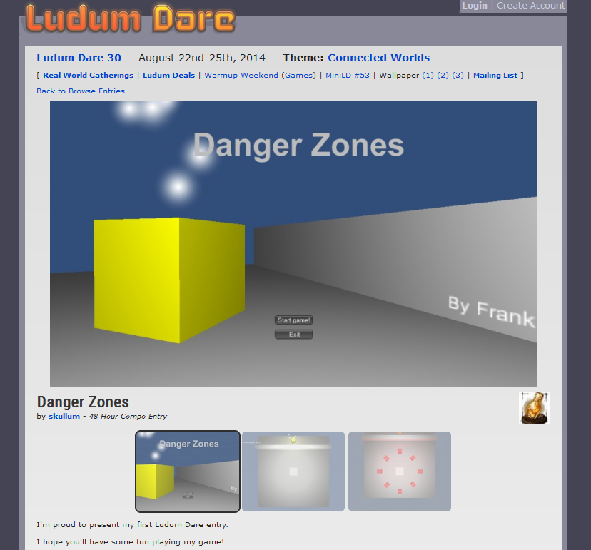
In the early days of Danger Zones, I would certainly not described it as a colorful game. The initial development of Danger Zones happened during a Ludum Dare game jam event. Back then I had almost no experience as a game designer. Programming is my strength so I decided to focus on gameplay and mechanics, and hope that these make up for what’s lacking in the visual design. I made another post on this particular game jam event featuring screenshots of Danger Zones’ entry page, you will be amazed by the difference when comparing then vs. now.
Trip down memory lane: Danger Zones’ entry page of LD30
Jam’s over now what?
After the Ludum Dare event was over, I decided to continue the development of Danger Zones to make it into a full game. This happened during my college days in my spare time. I was studying software engineering and while that’s a useful skill, it didn’t help much in terms of improving my game visually. As a result, Danger Zones looked marginally better, but still completely dull, still not a colorful game by any definition.
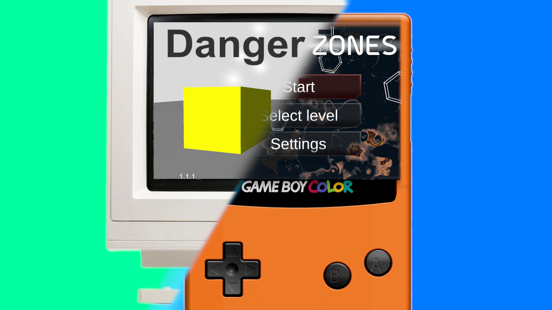
Only the functional elements in the game had a somewhat interesting color. Hazards were red: “Touching red will kill you”. Helpful things were green: “Touching green will help you”. The goal object of each level was a shiny golden cube. The will was there but the skill was not. I decided to release the game anyway, I folded in terms of visual design, in other words, I gave up. But not releasing the game would’ve been a shame. The gameplay wasn’t half bad, and there was some originality. It just needed some more care that I couldn’t give it back then. In essence, I released a grey box prototype as a full game.

Reaching out for help
I tried hiring someone for the design of the game. A friend recommended this to me, they also had some experience with game development (alas, not in visual game design). This idea had crossed my mind before, but I figured that this would be challenging in terms of communication, and pricey as well. To be perfectly honest, my pride also got in the way. Eventually, I found someone who wanted to cooperate on the Unity forums and negotiated a price that worked for me. But the cooperation didn’t work out for several reasons.
The main reason, is me being unable to express a design direction. The designer showed one or two iterations throughout a couple of weeks. I tried my best to provide clear feedback. After a while they couldn’t provide a new iteration, they said they kept having technical difficulties. I grew frustrated with the whole process and decided to end the cooperation. I was back to square one, struggling to make Danger Zones look decent enough for a release. Eventually, I settled for what’s now known as the first production release of Danger Zones.

Stealth release
Danger Zones’ release did not gain any traction. Throughout a few years maybe a handful of people downloaded Danger Zones from the Google Play store. To be fair I also didn’t do proper marketing for Danger Zones either. I wonder if a game in that state is even marketable as a fully released game. But anyway, I expected this outcome but that was still a bitter pill to swallow. A dent in my ego as well, but I didn’t want to give up. But it wasn’t until years later that I got serious about learning visual aspects of game design. I made a post about getting started with game design on my personal website. Go ahead and take a look, it might help you get started as well.
https://frankgoyens.github.io/gamedev/2022/01/12/game-development-journey.html
The “root cause revelation”

The design direction, or lack thereof, was the root cause of my problems. I couldn’t figure out how to make Danger Zones look good myself. Explaining what design I would want didn’t go well even if I managed to hire a designer. So I decided to enter in online courses to get started on game design in my spare time. At this time I’m working full-time as a software engineer and I’m starting a family so I had limited time. One thing, if not the most important thing, I learned from these online courses is color psychology.
Color psychology is the theory of which color evokes which mood or feeling. Color psychology is sometimes scrutinized. Not everyone is on board with the idea that colors evoke feelings, let alone that everyone would experience the same feeling for a given color. But consider the following: you’re a software engineer who has to pick a good color for their game, where do you start? To me, it lowered the difficulty of choosing colors in general, since I now had guidelines. Besides, the course also outlined concepts like complementary colors, the advantages of working with HSV instead of RGB, and more. I was one step closer to making a colorful game.
Little by little I managed to finally get my game on track in terms of design direction. I explained this process in more detail in another article: Mobile game like a retro handheld game: a Danger Zones study. Hopefully my experiences determining a design direction could help you as well. Even though I had a breakthrough, there is still a lot to do on my game Danger Zones.
Colorful game incoming
That’s where this new colorful update comes into play. There are two reasons for this update. I wanted to make the game look better visually, and I wanted to make my game’s levels more comprehensive. The levels in Danger Zones aren’t exactly laid out familiarly when comparing it to other games. This is a strength of Danger Zones, it’s my way of being original. We can all agree that the mobile gaming market could use some more originality. But it’s also a challenge to ensure the player understands how to navigate the levels.
Friends and co-workers sometimes play-test my game. I noticed that the player who went through the tutorial understood the level navigation well enough. Someone looking over the shoulder during other levels would still be confused however. I think even someone who catches a glimpse of a level should not be confused, because that would mean that gameplay footage that I share or post could be confusing as well, and that’s bad for marketing.
Colorful game design process outline
So here’s what I came up with: Indicate which level layer is the bottom one and highlight the current layer to make it more distinct from the layer below. When I think of highlighting something, I think of applying a bright color. Amethyst is a mysterious color (according to color psychology at least) so that’s the first color I tried. But how do I apply the color to the layers? To indicate to the player you can go no further when at the bottom layer, my idea was to have a forcefield. Think a wall made out of a laser.
Forcefields usually ripple and pulse (the cool-looking ones at least). I wanted to try using a material like what’s sometimes used for the surface of water. That kind of material usually works by having two textures move in different directions on top of each other to create a rippling effect.
Another aspect of a cool-looking forcefield is the way it becomes visible. Some parts appear gradually before others until everything comes together in one forcefield. I incorporated the rippling effect and gradual appearance into a shader and used it to configure the forcefield material. How’s our forcefield looking now?
The forcefield has a rippling effect and it appears gradually as the player moves down. The color looks good, how mysterious!
It looks fine but could use some more tweaking, and there’s a problem:
Elements on the same layer are “z-fighting” with the forcefield. They pop in front and behind the forcefield depending on the camera’s position.
This again!?
Traditional alpha blending is a pain for this reason, some elements of my levels are already rendered using transparency using a stippling a.k.a. screendoor effect. But I have some doubts that this alternative transparency method would be a good choice in this case, it would’ve been too much of the same, and I want to reserve the stippling effect for foreground elements, so I tried something else.
There was also still the question of how I would mark layers with a bright color to make them more distinct from the bottom layers. I could hit two birds with one stone by reimagining the forcefield, I could use any texture for the “forcefield” shader, and what would blend well with the currently existing white stars? What about the existing stars’ texture? That texture is filled in sparsely – most of the texture is completely transparent so it would blend well, and indeed, after converting the colored forcefield into colored stars there was no more Z-fighting with the existing stars. Discarding the forcefield is kind of a shame, but this would require more changes to existing elements while we’re currently just looking for something to add instead, I should spend my time wisely and not let the scope increase. So let’s see what we have now.
Things are coming together nicely
I’m looking at quite a colorful game already, however, I should still mark the bottom layer using a different color to indicate we’re at the bottom. A forcefield would’ve conveyed this more naturally in my opinion, but this has the aforementioned problems, simply setting a different color will do for now, and we’ll let play-testers confirm or deny whether it’s good enough.
Colorful game galore! A satisfactory conclusion
And so the visual design of the update has concluded, and I was able to provide you with an update, and in due time with a colorful game instead of a “grey box” prototype. Looking back at the early beginnings of Danger Zones, and the struggles of color and visual design choices, I am proud of the progress that was made. A simple update like this had a lot of underlying meaning to me, and I thank you for taking the time to read all about it.
(Here’s the complete video again just in case you missed it at the top of the page:)